CASE STUDY 1:
REINVENTING A MUSIC STREAMING SERVICE
Figma Project
For years, Spotify and Apple Music have the top streaming services for a number of reasons - friendly interface, ease of use, etc. For a while, it seemed the majority of users just stuck with the service they first signed up for, perhaps the ease of use, habit of using the app, and saved playlists kept folks on (this was certainly the case for myself).
Lately though, as of August 2025, I have noticed a lot of people in my direct circle shift away from Spotify in particular as their preferred music and podcast streaming service. Some switched away from Spotify and/or Apple Music because of the price (YouTube Premium subscribers already receive YouTube Music in their subscription - same with Amazon Prime with Amazon Music), some switched from Spotify because of Daniel Ek’s politics, and some switched because of a newfound appreciation for higher quality audio.
My wife and I both have recently made the switch from Spotify to YouTube Music, for a mix of all the reasons stated above (mainly I want higher quality audio, and she already pays for YouTube premium). However, since the switch, we have regularly been chatting about the user experience of the app - it’s not as intuitive as Spotify or even Apple Music. The homepage is messy, with suggestions all over the place, some of the app’s personalized top suggestions aren’t things we’d consider to be on-point, and overall it’s been a bit of a learning curve to understand how to efficiently use the app.
This project is a deeper look into the homepage of a streaming service platform, and what it would take to convince a user to switch away from something they’re used to using. In this case, I’ll ask (via survey) what matters to users and why, and using the results I’ll develop some wireframes and UI for the homepage of a streaming service platform (let’s say a “redone” version of YouTube Music) that actually gives the people what they want.
The main focus of this project is UX Research and
UX Design (wireframing & lo-fi prototyping).
There is an intentional less focus on UI Design.
What Matters Most:
User Testing 1
SurveyMonkey Poll questions for research:
1. What streaming service do you use (if at all)
2. Why do you use it? (Or why don’t you use a streaming service?) - what do you look for
3. What’s the first thing you typically do on the app? - user behavior
(search for something, go to a playlist, click a suggestion off the homepage, play a radio station, other)
4. On a scale of 1 (poor) to 5 (amazing), how intuitive in the homepage interface to you (ease of use, suggestions provided, etc)
5. Would you consider switching to another streaming service? - pain points(Yes/No/Maybe)
6. If so, what would be needed to convince you to switch? (Think experience, not price)
7. Anything else you’d like to add?
Results & Thoughts:
First of all, the results of this survey really showed me the importance to asking the right questions.
I received really great insight/data from users, but reading through everything often left me with more follow-up questions.
Maybe I had too many text boxes and should have been more strategic with turning those questions into multiple choice.
Lesson learned. Either way, I have enough data to make some informed decisions on next steps. But first, let’s go over the results:

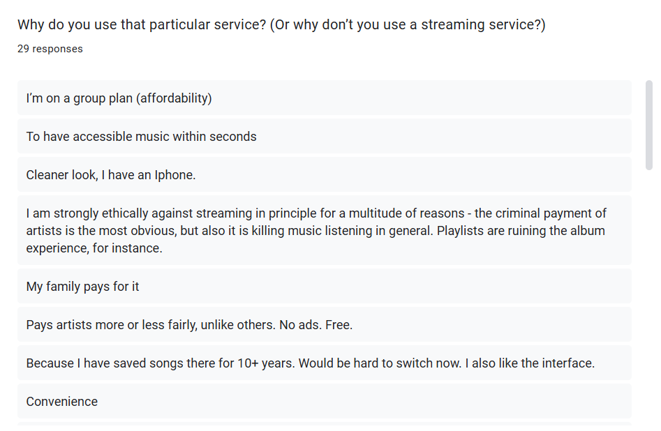
Questions 1 & 2: